Heartfulness.
Branding the Heartfulness4Kids initiative

Introduction
Heartfulness4Kids helps children and parents build calm through mindfulness. Parents decide to enroll. Children have to feel welcome. The brand had to speak to both.
The Challenge
The Heartfulness4Kids initiative needed its own distinct identity within the broader Heartfulness brand. It couldn't feel like a generic children's extension of the parent organization; it needed to feel purposeful, welcoming, and age-appropriate while maintaining the spiritual integrity that Heartfulness represents.
The branding had to work across an unusual range of applications: educational materials for schools, social media content for parents, printed resources for community centers, and digital platforms for program enrollment.
Our Solution
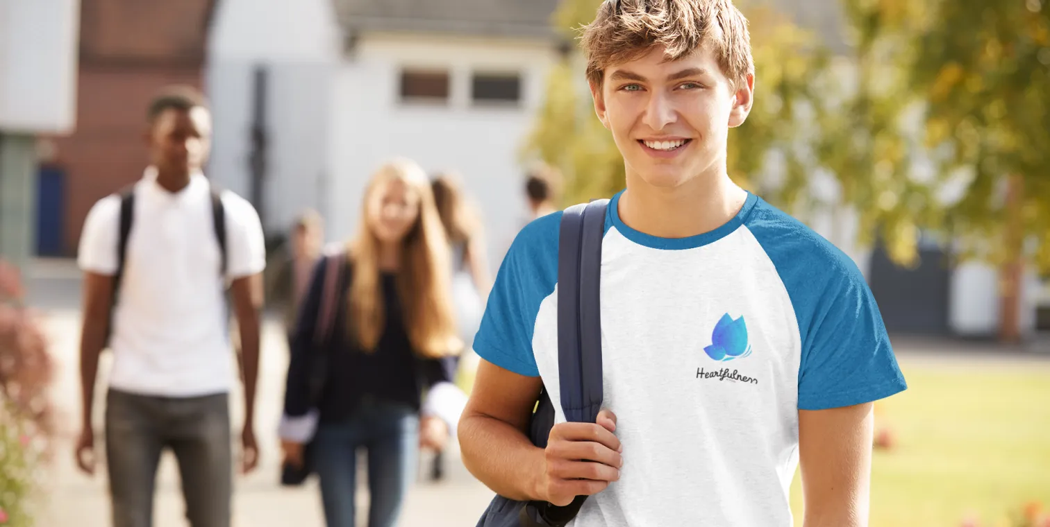
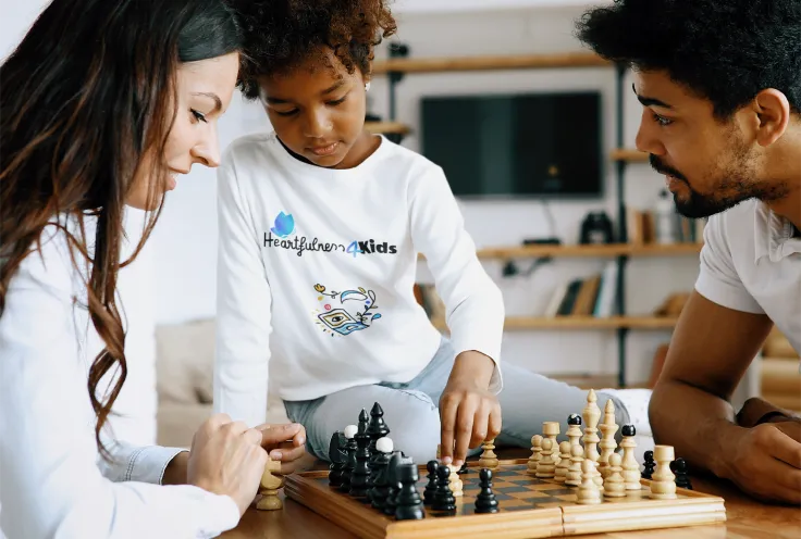
We created a complete visual identity for Heartfulness4Kids: a warm, approachable logo communicating mindfulness and growth; friendly, readable typefaces feeling nurturing without being childish; a color palette evoking calm, warmth, and positivity; comprehensive brand guidelines; and design application across educational materials, social media templates, print-ready materials, and digital assets.
The Roadmap
Building a strong brand involves moving through defined stages.
Discovery
Understanding the Heartfulness4Kids mission and the delicate balance between children's appeal and spiritual integrity.
Brand Strategy
Defining a distinct identity within the broader Heartfulness brand.
Visual Identity
Creating warm, approachable design elements resonating with both children and parents.
Heartfulness4Kids Identity
A distinct, purposeful identity that feels welcoming and age-appropriate while maintaining the spiritual integrity of the Heartfulness brand.
Multi-Channel Application
Design application across educational materials, social media, print resources, and digital platforms: consistent across all contexts.
Key Outcomes
Families dealing with stress need gentle, approachable support. Peacock India understood this perfectly and created branding that feels like a warm hug: trustworthy and nurturing. Since the rebranding, parent engagement in our resilience programs has increased significantly. They helped us communicate our values in a way that truly connects with parents and provides them with the comfort they need.

Glofi.
Let's build something
that works.
Tell us what you're building. We'll outline a clear roadmap to bring it to life — no pitch, just honest direction.